


We got in line!
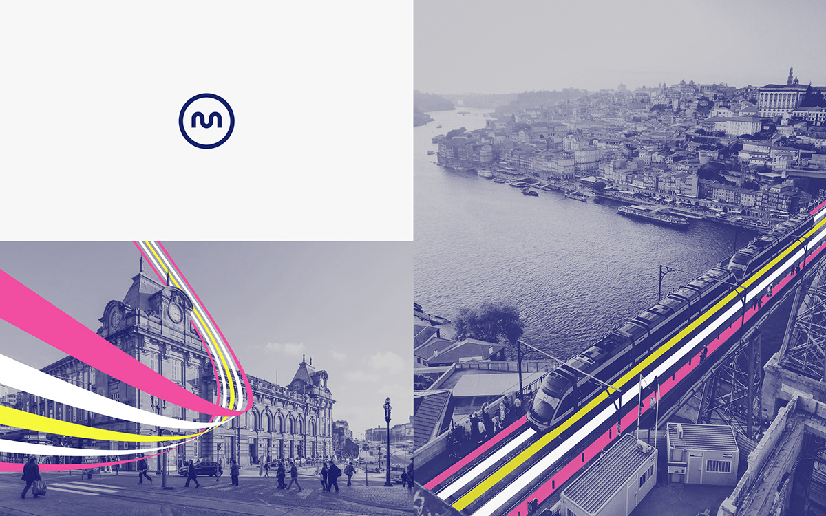
We take over the design and communication of the new lines of Metro Do Porto.
We take over the design and communication of the new lines of Metro Do Porto.
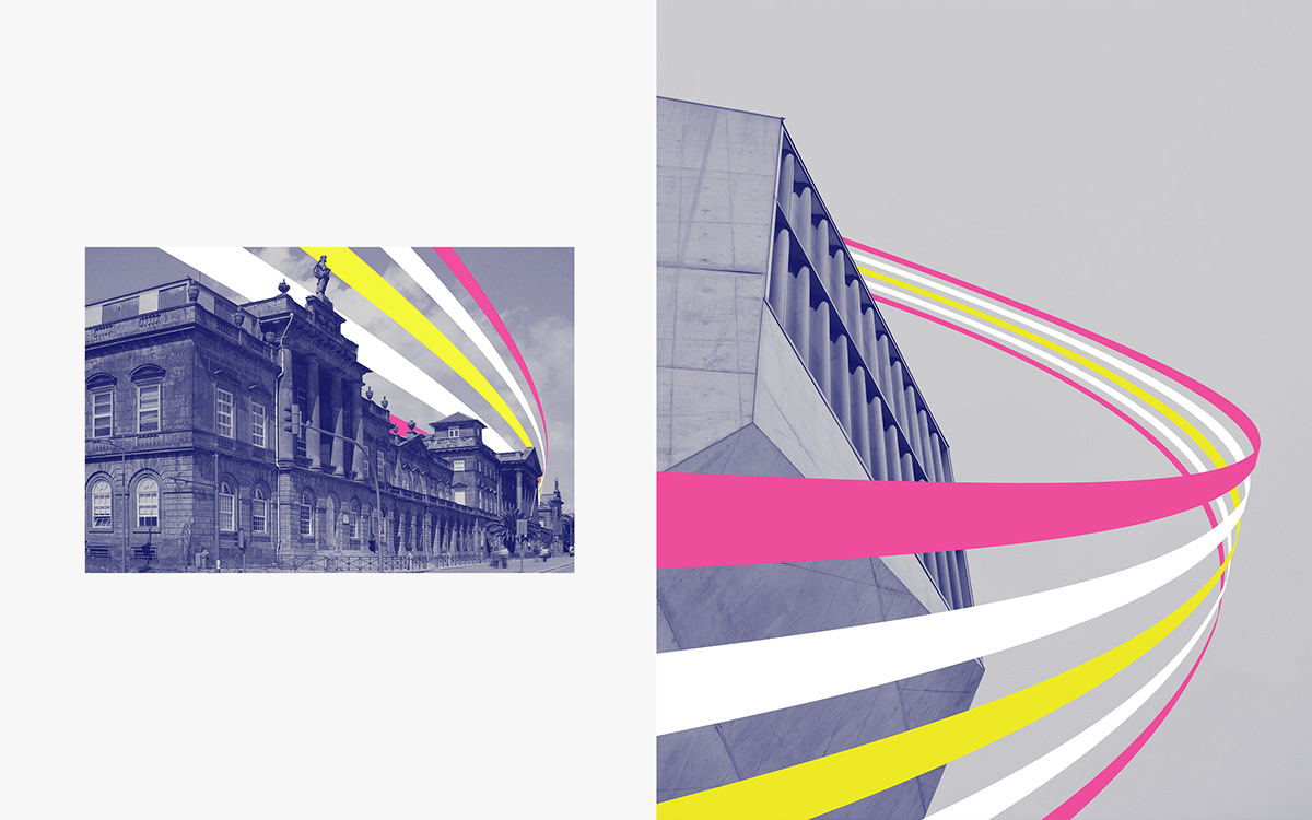
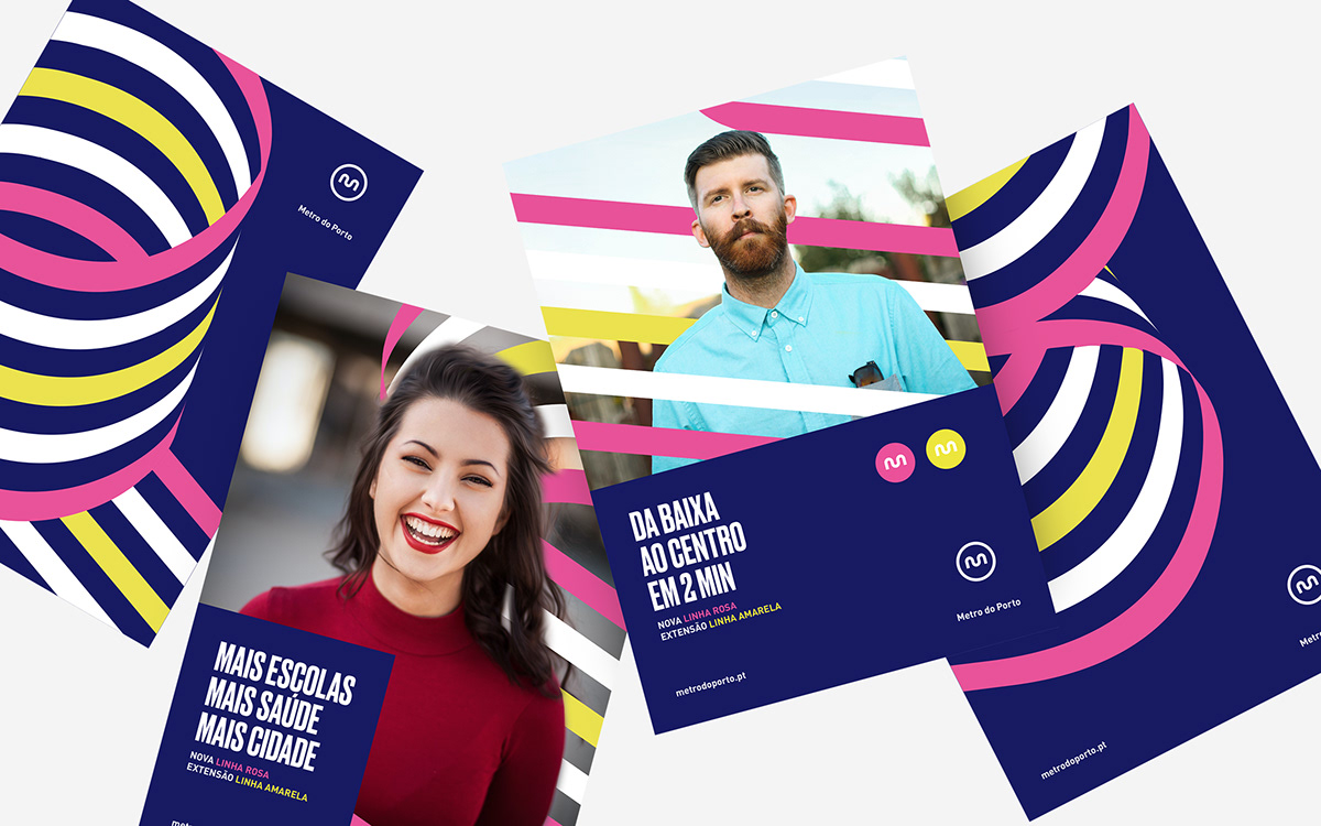
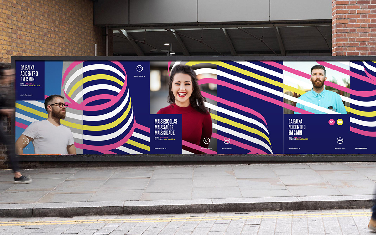
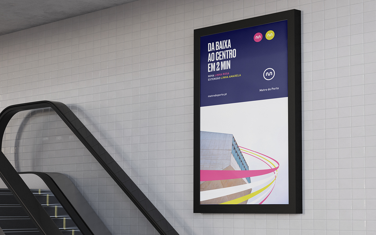
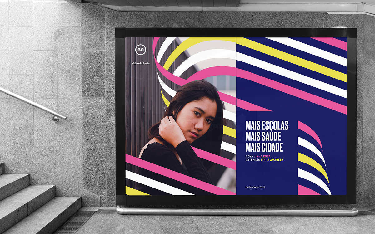
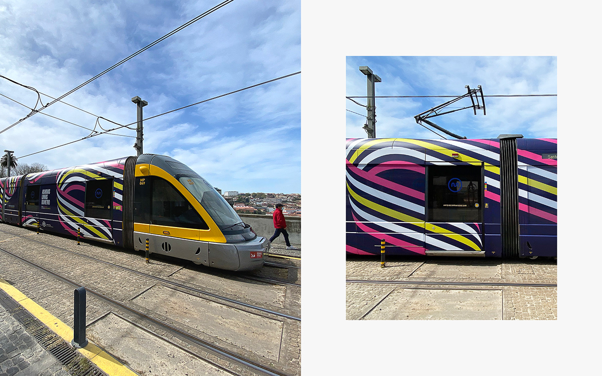
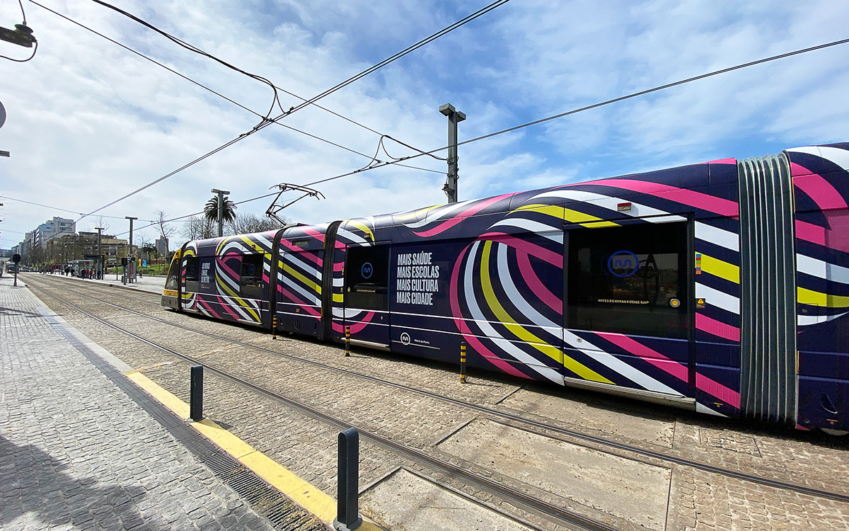
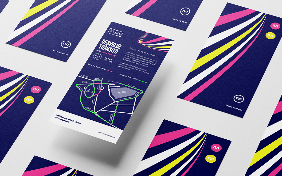
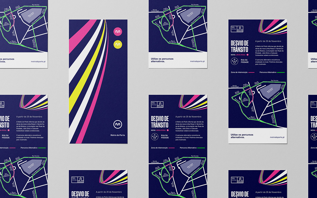
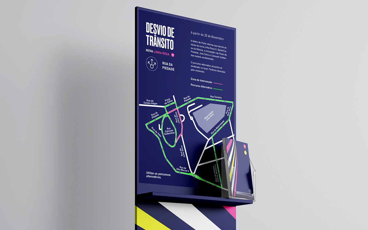
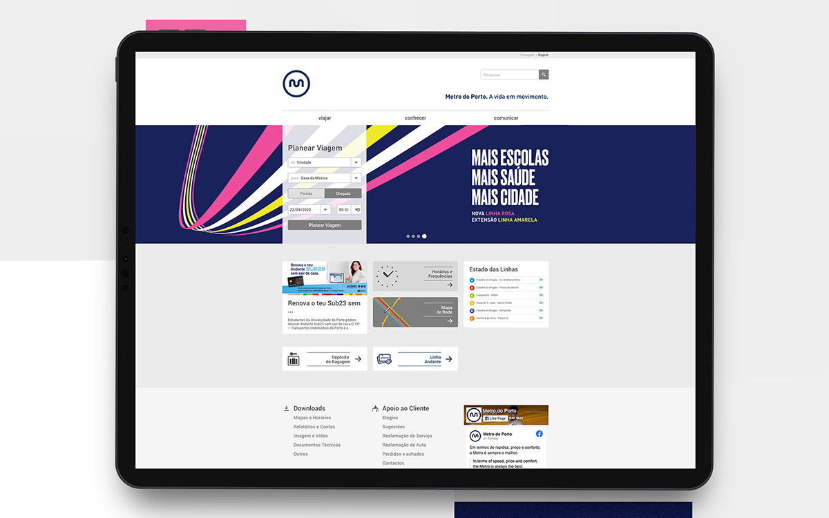
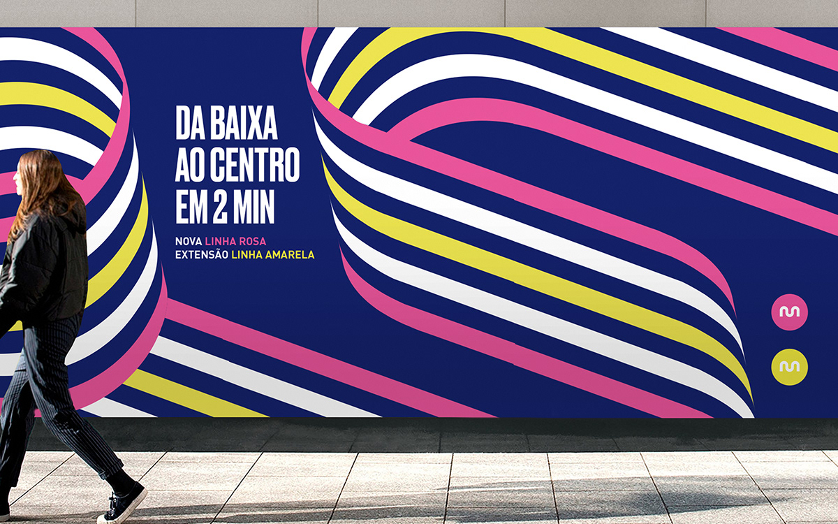
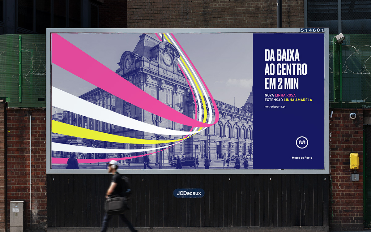
Our graphic proposal aims to contemplate a concept of movement and constant involvement. These are new lines that surround us, lines that bring us closer to the city, allowing us to be closer and go further. In this way, the new lines will bring more passengers, greater mobility, travel for hospitals and schools, a closer proximity of the two cities Porto and Gaia. More schools, more health, more city.
The chromatic range was applied to the colors of the respective yellow and pink lines of Metro do Porto.
Art Direction / Design
Bullseye aim on branding
Bullseye aim on branding
Client
Metro do Porto
Metro do Porto
2020


